(12)Landing page · Meta Challenge

Meta Quest Pro

In the Meta Challenge, the goal was to build the Meta Quest Pro sales page in Portuguese. The first version worked, but it borrowed colours, tone and even words from another brand. The redesign reworked the experience end to end.

Year
2026
Role
UX/UI Designer · research, audit, UI and handoff
Scope
Product landing page, desktop and mobile
Tools
Figma · variáveis · modos

02Summary

A landing page that looked like another brand.

  1. Audit

    9 problems costing trust and conversion, 4 of them high severity.

  2. A buying narrative

    From 14 loose blocks to a sequence that leads to a decision.

  3. System

    Tokens with Light and Dark modes, and components before screens.

03Audit

9 problems costing trust and conversion.

Identity borrowed from another brand, a price that contradicts itself (R$ 249.90 in the hero and US$ 999.99 in the comparison), text at 3.6:1 contrast, translated product names, copy from another product and 32 px tall buttons.

04Principles

Four principles guided every decision.

  1. One brand, one voice

    Meta's palette and tone, official product names and no terms borrowed from competitors.

  2. Clarity sells

    One consistent price, benefits before specs and one main call to action per fold.

  3. Accessible by default

    AA contrast on all text, 44 px touch targets and content that doesn't depend on hover.

  4. A system, not screens

    Tokens with Light and Dark modes, components with properties and sections that scale from desktop to mobile.

05Architecture

From 14 loose blocks to a buying narrative.

A hero with specs, three pillars (work, create, collaborate), what's in the box, features, creative flow, testimonials, apps, a comparison, FAQs and a final call to action.

06Hero

A hero that explains itself in 5 seconds: what it is, who it's for and what it costs, with the specs right below.

07Before and after

The same page, a different brand perception.

08Sections

Benefits before specs.

09Mobile

Designed for the thumb, at 375 px.

10Design system

Tokens first. Screens second.

Variables in three collections, Light and Dark modes applied per section, text styles and a component library, in a file someone else can pick up.

11File

A file someone else can use.

variables in 3 collections
54
text styles
12
colour modes, Light and Dark
2
components and icons
9 + 23

The original file had 0 variables and 0 text styles.

12Credits

Who made it, and with what.

Role
Rafael Cavalcante · UX/UI Designer
Project
Meta Challenge
Tools
Figma (variables, components, modes)
Imagery
Editorial images generated with AI (Higgsfield)

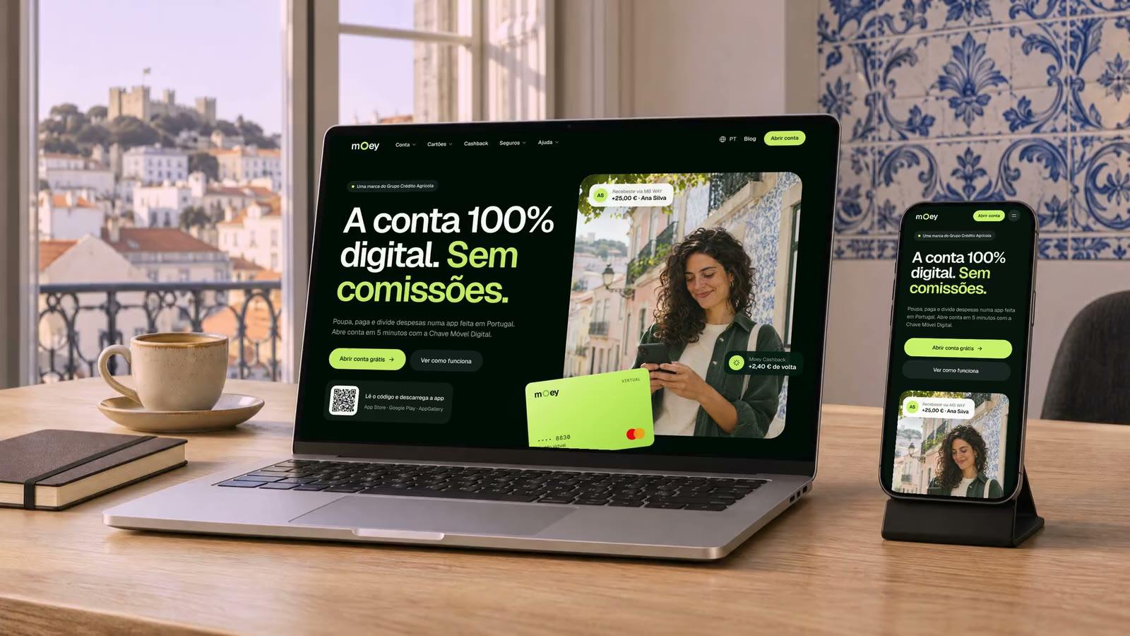
Product images come from the original material and editorial images were generated with AI. The cover scene was also generated with AI (Higgsfield), with the real Figma screens.

Enjoyed the case?

See the full project on Behance too, and leave a like.

View on Behance(opens in a new tab)
Next case(13) Digital bank · Crédito AgrícolaMoey

01 / 00

Let's talk

Pick a channel. Both reach me directly.